
display 决定元素的“显示类型”,常用:
block:块级元素(独占一行,可设置宽高)inline:行内元素(不独占一行,宽高不生效)inline-block:行内块(不独占一行,但宽高生效)none:隐藏元素(不占位)flex:弹性布局(非常常用)
.container {
  display: flex;
}
1、创建一个名为css-study的文件夹并使用VSCode打开,再创建一个名为9-1.CSS常用属性-display属性.html
<!DOCTYPE html>
<html>
<head>
    <title>display: flex基础</title>
    <style>
        .container {
            display: flex; /* 启用flex布局 */
            background: #ecf0f1;
            padding: 10px;
            margin: 20px;
            border: 2px solid #3498db;
        }
        .item {
            width: 80px;
            height: 50px;
            background: #e74c3c;
            margin: 5px;
            color: white;
            display: flex;
            align-items: center;
            justify-content: center;
        }
    </style>
</head>
<body>
    <h2>display: flex 容器</h2>
    <div class="container">
        <div class="item">1</div>
        <div class="item">2</div>
        <div class="item">3</div>
    </div>
</body>
</html>
2、双击【9-1.CSS常用属性-display属性.html】,观察到三个红色方块自动水平排列,默认左对齐
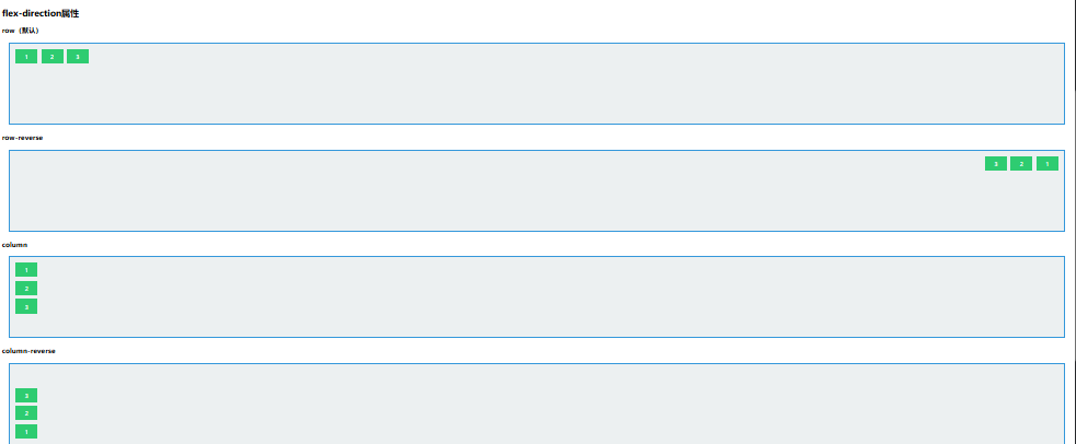
一、flex排列方向
控制主轴方向(元素从哪边开始排)
.container {
  display: flex;
  flex-direction: row;         /* 默认:从左到右 */
  /* flex-direction: column; */ /* 从上到下 */
}
示例说明:
1、创建一个名为css-study的文件夹并使用VSCode打开,再创建一个名为9-2.CSS常用属性-display属性-fiex排列方向.html
<!DOCTYPE html>
<html>
<head>
    <title>flex-direction演示</title>
    <style>
        .container {
            display: flex;
            background: #ecf0f1;
            padding: 10px;
            margin: 20px;
            border: 2px solid #3498db;
            height: 200px;
        }
        .row { flex-direction: row; }
        .row-reverse { flex-direction: row-reverse; }
        .column { flex-direction: column; }
        .column-reverse { flex-direction: column-reverse; }
        .item {
            width: 60px;
            height: 40px;
            background: #2ecc71;
            margin: 5px;
            color: white;
            display: flex;
            align-items: center;
            justify-content: center;
        }
    </style>
</head>
<body>
    <h2>flex-direction属性</h2>

    <h3>row(默认)</h3>
    <div class="container row">
        <div class="item">1</div>
        <div class="item">2</div>
        <div class="item">3</div>
    </div>

    <h3>row-reverse</h3>
    <div class="container row-reverse">
        <div class="item">1</div>
        <div class="item">2</div>
        <div class="item">3</div>
    </div>

    <h3>column</h3>
    <div class="container column">
        <div class="item">1</div>
        <div class="item">2</div>
        <div class="item">3</div>
    </div>

    <h3>column-reverse</h3>
    <div class="container column-reverse">
        <div class="item">1</div>
        <div class="item">2</div>
        <div class="item">3</div>
    </div>
</body>
</html>
2、双击【9-2.CSS常用属性-display属性-fiex排列方向.html】,观察到显示四种排列方向对比
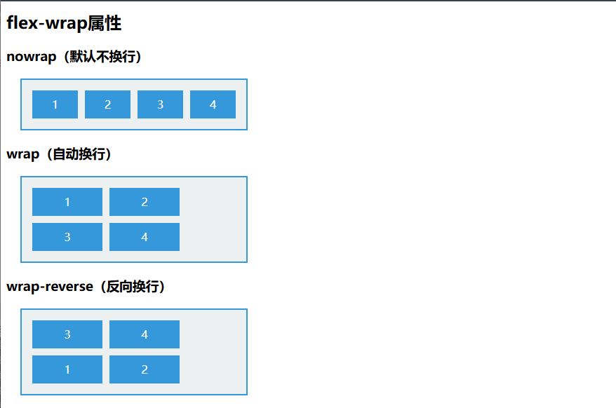
二、flex换行方式(flex-wrap)
默认不换行,挤不下会压缩
.container {
  display: flex;
  flex-wrap: nowrap; /* 默认 */
  /* flex-wrap: wrap; */ /* 自动换行 */
}
示例说明:
1、创建一个名为css-study的文件夹并使用VSCode打开,再创建一个名为9-3.CSS常用属性-display属性-fiex换行方式.html
<!DOCTYPE html>
<html>
<head>
    <title>flex-wrap演示</title>
    <style>
        .container {
            display: flex;
            background: #ecf0f1;
            padding: 10px;
            margin: 20px;
            border: 2px solid #3498db;
            width: 300px;
        }
        .nowrap { flex-wrap: nowrap; }
        .wrap { flex-wrap: wrap; }
        .wrap-reverse { flex-wrap: wrap-reverse; }
        .item {
            width: 100px;
            height: 40px;
            background: #3498db;
            margin: 5px;
            color: white;
            display: flex;
            align-items: center;
            justify-content: center;
        }
    </style>
</head>
<body>
    <h2>flex-wrap属性</h2>

    <h3>nowrap(默认不换行)</h3>
    <div class="container nowrap">
        <div class="item">1</div>
        <div class="item">2</div>
        <div class="item">3</div>
        <div class="item">4</div>
    </div>

    <h3>wrap(自动换行)</h3>
    <div class="container wrap">
        <div class="item">1</div>
        <div class="item">2</div>
        <div class="item">3</div>
        <div class="item">4</div>
    </div>

    <h3>wrap-reverse(反向换行)</h3>
    <div class="container wrap-reverse">
        <div class="item">1</div>
        <div class="item">2</div>
        <div class="item">3</div>
        <div class="item">4</div>
    </div>
</body>
</html>
2、双击【9-3.CSS常用属性-display属性-fiex换行方式.html】,展示不同换行方式的空间分配
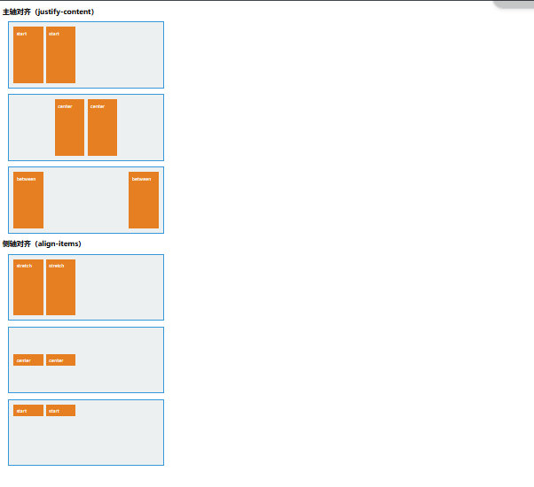
三、flex对齐方式(非常重要)
Flex 里有两个方向:
- 主轴对齐:
justify-content - 交叉轴对齐:
align-items
主轴对齐 justify-content
.container {
  display: flex;
  justify-content: flex-start; /* 左对齐 */
  /* center / space-between / space-around / space-evenly */
}
交叉轴对齐 align-items
.container {
  display: flex;
  align-items: center; /* 垂直居中(当主轴为 row 时) */
}
最常用的“水平垂直居中”组合:
.container {
  display: flex;
  justify-content: center;
  align-items: center;
}
示例说明:
1、创建一个名为css-study的文件夹并使用VSCode打开,再创建一个名为9-4.CSS常用属性-display属性-fiex对齐方式.html
<!DOCTYPE html>
<html>
<head>
    <title>Flex对齐方式</title>
    <style>
        .container {
            display: flex;
            background: #ecf0f1;
            padding: 10px;
            margin: 20px;
            border: 2px solid #3498db;
            height: 200px;
            width: 500px;
        }
        .justify-start { justify-content: flex-start; }
        .justify-center { justify-content: center; }
        .justify-end { justify-content: flex-end; }
        .justify-between { justify-content: space-between; }
        .justify-around { justify-content: space-around; }

        .align-stretch { align-items: stretch; }
        .align-center { align-items: center; }
        .align-start { align-items: flex-start; }

        .item {
            width: 80px;
            background: #e67e22;
            margin: 5px;
            color: white;
            padding: 10px;
        }
    </style>
</head>
<body>
    <h2>主轴对齐(justify-content)</h2>
    <div class="container justify-start">
        <div class="item">start</div>
        <div class="item">start</div>
    </div>
    <div class="container justify-center">
        <div class="item">center</div>
        <div class="item">center</div>
    </div>
    <div class="container justify-between">
        <div class="item">between</div>
        <div class="item">between</div>
    </div>

    <h2>侧轴对齐(align-items)</h2>
    <div class="container align-stretch">
        <div class="item" style="height: auto;">stretch</div>
        <div class="item" style="height: auto;">stretch</div>
    </div>
    <div class="container align-center">
        <div class="item">center</div>
        <div class="item">center</div>
    </div>
    <div class="container align-start">
        <div class="item">start</div>
        <div class="item">start</div>
    </div>
</body>
</html>
2、双击【9-4.CSS常用属性-display属性-fiex对齐方式.html】